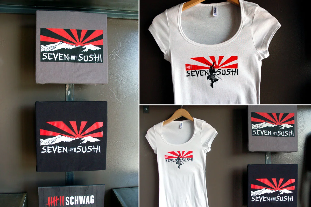
The Seven Sushi restaurant/sushi bar apparel design all revolves around the my choice of the Japanese rising sun image as the main focus. The Rising Sun Flag was originally used by feudal warlords in Japan during the Edo Period (1603–1868 CE). On May 15, 1870, as a policy of the Meiji Government, it was adopted as the war flag of the Imperial Japanese Army, and on October 7, 1889, it was adopted as the Naval Ensign of the Imperial Japanese Navy. It is still used in Japan as a symbol of tradition and good fortune, and is incorporated into commercial products and advertisements.
I felt it was fitting imagery that screamed sushi and Japanese traditional food. I found a font that followed suite to match the look and feel of the rising sun image. I then used a more Montana (instead of Mt Fuji, Japan) looking mountain scape image to couple with the rising sun in an east meets west motif. The female samurai/japanimation image I created to tie in another element of Japanese culture that would be relatable to millennials and Gen-Xers.
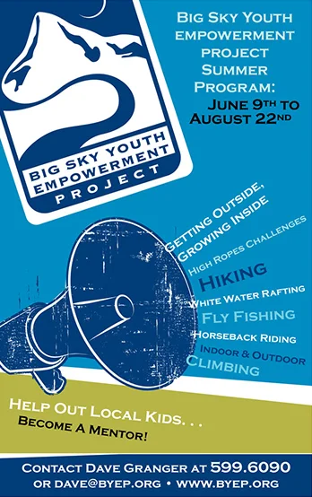
The Big Sky Youth Empowerment (BYEP) is a non-profit in Gallatin Valley that provides a program where youth are grouped with peers, mentors, and program managers for weekend adventures and weekday workshops. Adventures build confidence as they explore Montana's outdoors. They also meet one week day evening for workshops with curriculum focusing on building healthy relationships, independent decision making, and interpersonal skills. Their goal is to equip the youth with the skills to make educated decisions towards an empowered and independent future.
BYEP is a well known entity in our area, so my goal was to present the information in a clear and concise manner. The logo holds a lot of weight as far as visual recognition goes, so I displayed it front and center so it would not be missed. I used the megaphone image to call out the different summer activities that BYEP provides for the youth. I try my best to create text that is easily readable, conveys a clear message and also make 100% sure the contact info is easy to find and big enough to see from a distance.
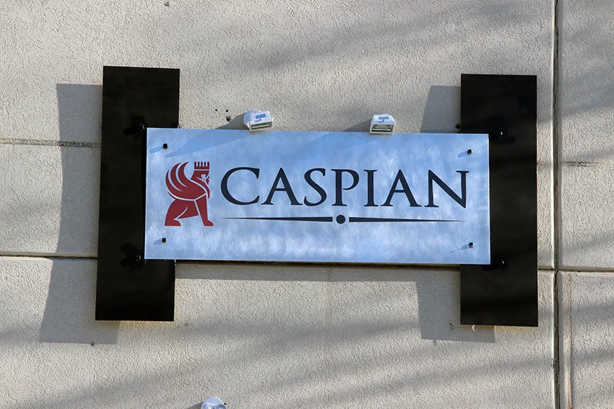
On this project I was subcontracted by another design firm here in Bozeman to create an identity package for Caspian Restaurant. They serve Persian and Mediterranean dishes. I focused on designing a logo that captured the culture and feel of the food and geographic region. I also created a set of fonts and color styles for the branding of Caspian. I went for a clean san serif font for the titles and a simple readable serif font for the body copy. I wanted the fonts to allow for quick interpretation without taking away from the images.
Title font: Helvetica Bold
Notable features of Helvetica as originally designed include the termination of all strokes on exactly horizontal or vertical lines and unusually tight letter spacing, which give it a dense, compact appearance.
Body copy: Garamond Light
Like all old-style designs, variation in stroke width is restrained in a way that resembles handwriting, creating a design that seems organic and unadorned. Garamond typefaces are popular and often used, particularly for printing body text and books.
The red color of the icon in the logo was inspired by the brick wall inside the space.
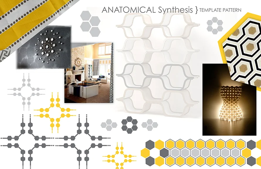
These 2 spreads appeared in the book Working : A Showcase of Graphic Design Alumni from Montana State University by Jeffery Conger.
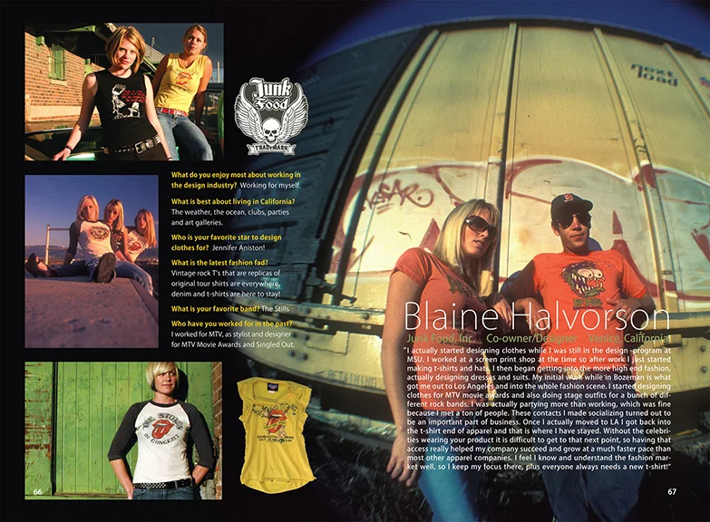
This was a project I worked on during my junior year in the graphic design department at MSU. We were each given an MSU Design School Alumni to contact, consult and then design book spreads to showcase their work. The alumni I was assigned was Blaine Halvorson: designer and co-founder of Junkfood, Inc. https://www.junkfoodclothing.com After speaking with him several times and getting familiar with his brand, he decided to send me a box of Junkfood apparel to use for the project. I found handful of willing Women to adorn the T-Shirts for a photoshoot. My friend and photographer Ryan Wilson took the photos and I organized and coordinated everyone to obtain the images needed to design the layout. This project was very fulfilling, rewarding and lots of fun from start to finish. Blaine was one of the highest profile alumni showcased in the book and I was honored to have the opportunity to work with him.
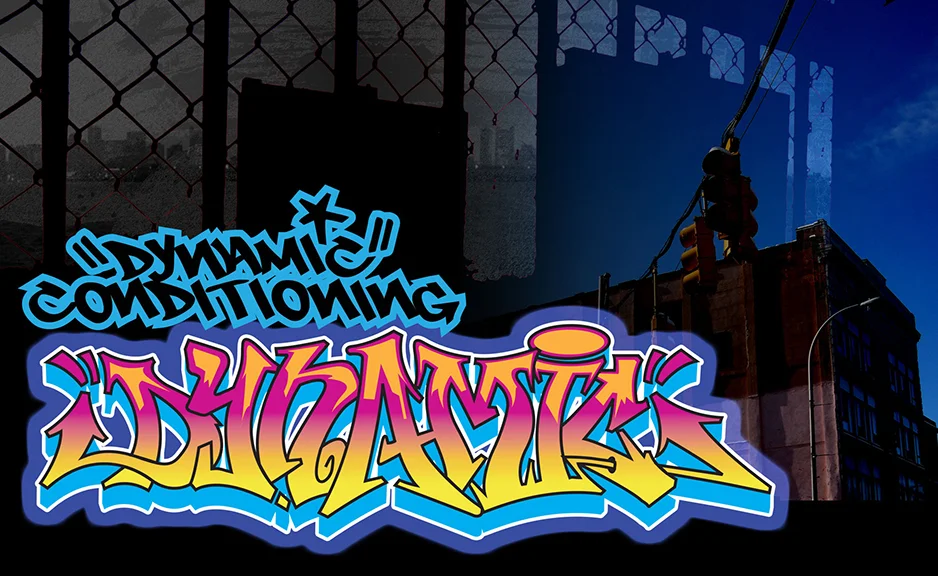
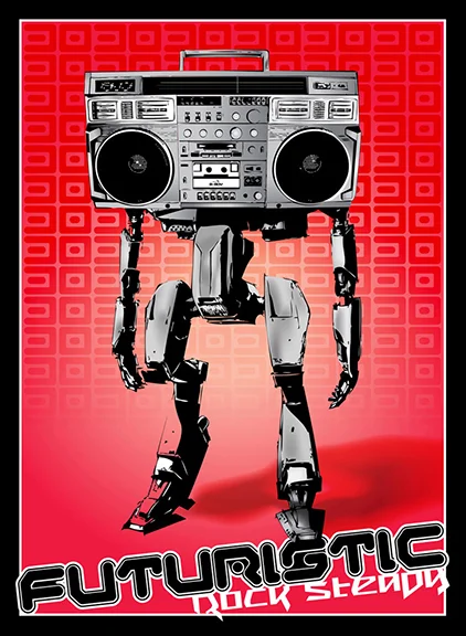
I designed this poster for an art exhibit at the Bozeman High School gallery. The exhibit was a showcase of local graphic designers and their current work, wether it be design or another medium. I wanted to showcase my background in graffiti art with this design. I took a hiphop icon (the boombox) and made it the focus of the concept. I recreated a photo of a boombox in Illustrator and created the robot body in Illustrator to attach the boombox head to. Rock Steady Crew is an American breakdancing and hip hop group which has become a franchise name for multiple groups in other locations. The group's 1983 international hit song "(Hey You)" (from the group's first studio album Ready For Battle) peaked at No. 6 on its fourth week on the UK singles chart and it reached the Top 10 in many European countries. Hence the title: Futuristic Rock Steady.
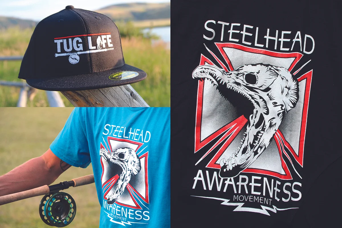
www.steelheadawarenessmovement.com