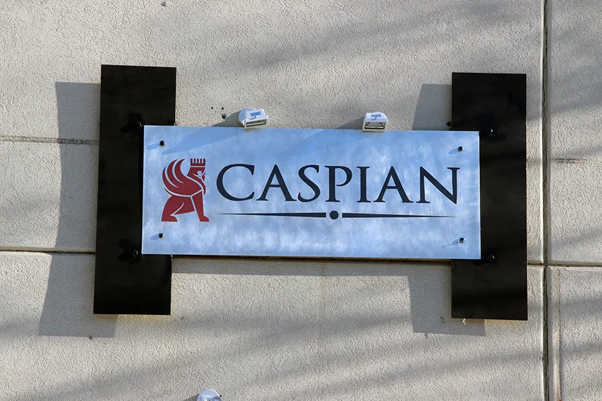
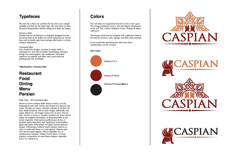
On this project I was subcontracted by another design firm here in Bozeman to create an identity package for Caspian Restaurant. They serve Persian and Mediterranean dishes. I focused on designing a logo that captured the culture and feel of the food and geographic region. I also created a set of fonts and color styles for the branding of Caspian. I went for a clean san serif font for the titles and a simple readable serif font for the body copy. I wanted the fonts to allow for quick interpretation without taking away from the images.
Title font: Helvetica Bold
Notable features of Helvetica as originally designed include the termination of all strokes on exactly horizontal or vertical lines and unusually tight letter spacing, which give it a dense, compact appearance.
Body copy: Garamond Light
Like all old-style designs, variation in stroke width is restrained in a way that resembles handwriting, creating a design that seems organic and unadorned. Garamond typefaces are popular and often used, particularly for printing body text and books.
The red color of the icon in the logo was inspired by the brick wall inside the space.